Immigration to Canada
Immigration to Canada has varied widely over the years, as is shown in Figure 10. Likewise, immigration to the Inner Ring has also varied. Variations in annual immigration to Canada probably have less to do with economic conditions than with political considerations and variations in administrative processing. Therefore, it is highly unlikely that the number of immigrants to Canada or the Inner Ring could be forecast using an economic model.
Figure 10: Immigration to Canada and to the Inner Ring, 1987 to 2004
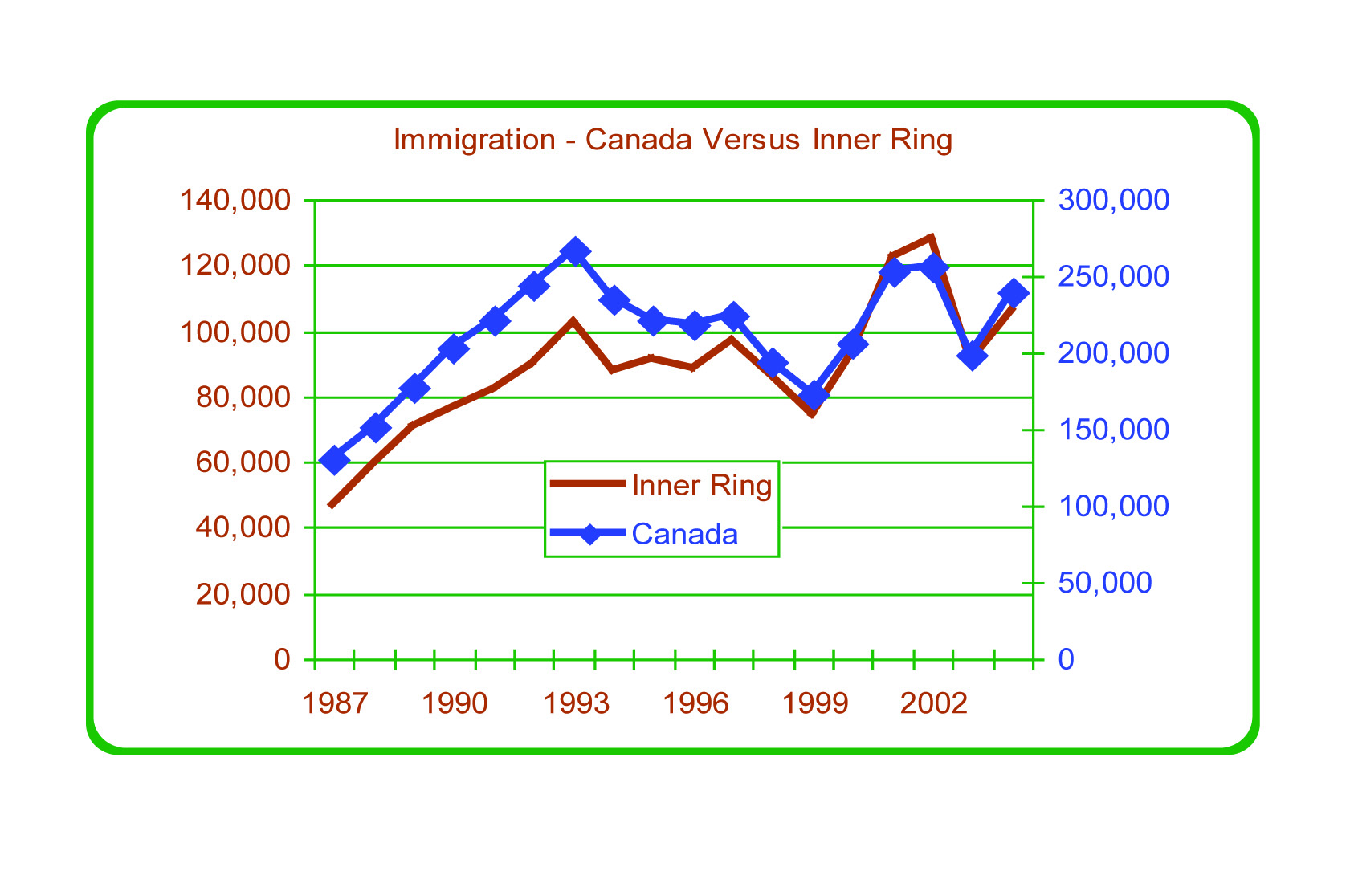
The pattern of immigration to the Inner Ring tends to follow that of the Canadian figures. The next section examines the share of immigrants who arrive in the Inner Ring, and the relationship between that share and economic variables.
Inner Ring
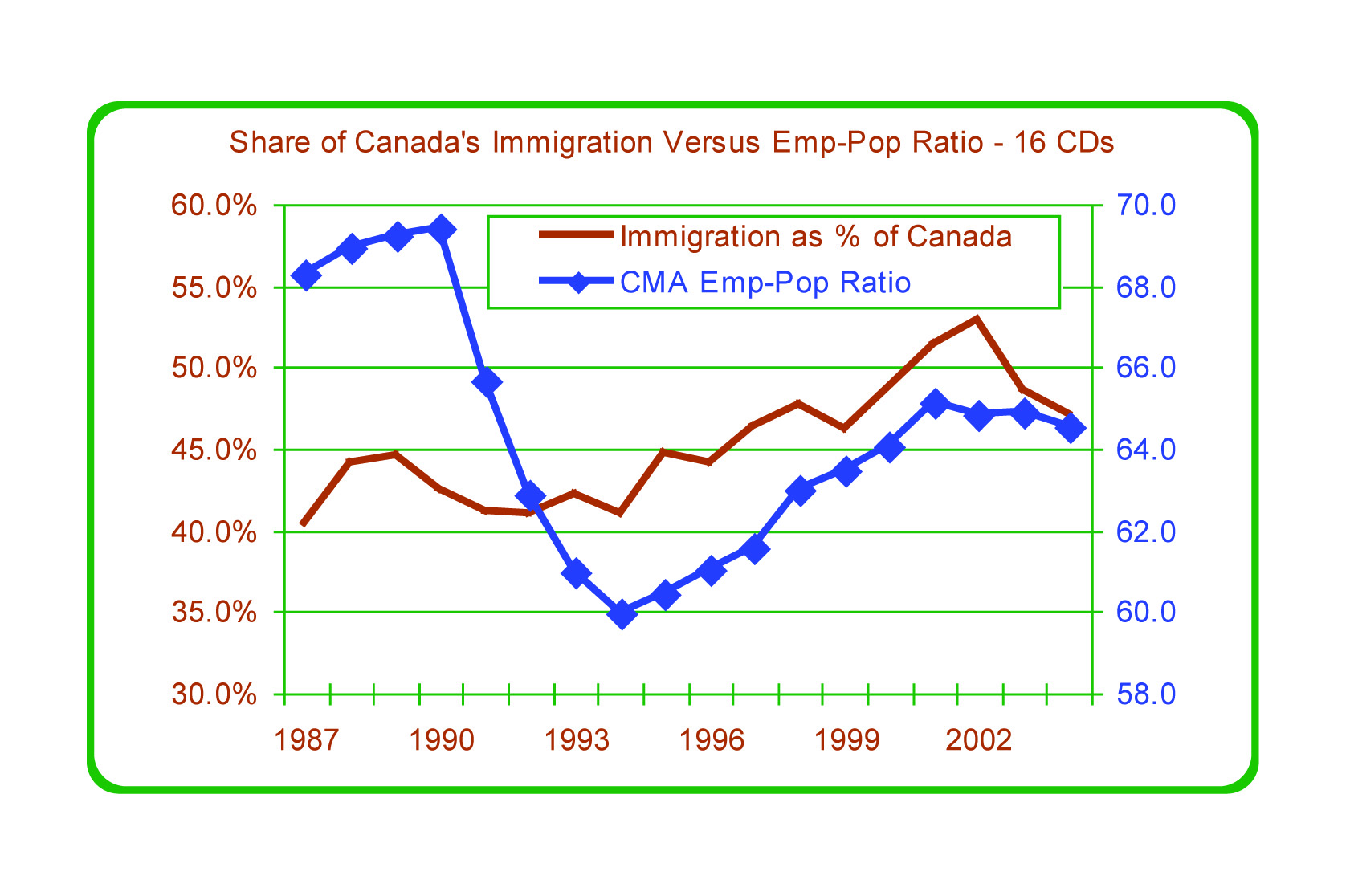
Figure 11 shows the relationship between the Inner Ring's share of Canada's immigration and the Toronto CMA employment-to-population ratio.* There appears to be a loose relationship between the two variables. In the early 1990s, when the employment ratio in the GTA was falling, the Inner Ring's share of immigrants also fell slightly. As the GTA employment rate rose during the second half of the 1990s, the immigrant share also rose. However, there was a large jump in the Inner Ring share during 2001 and 2002, followed by a setback in 2003 and 2004. It is unclear whether that setback was the result of the softening economy in the GTA, or a correction from an unusually high level in the previous years, or a combination of the two.
It appears that the share of immigration is influenced by economic cycles to some extent. The peak in the Inner Ring's share of Canada's immigration generally coincides with the peak in the economic cycle. Therefore, it is likely that the Inner Ring's share of immigration will be influenced by future economic conditions.
Figure 11: Inner Ring Share of Canada's Immigration vs. Employment-to-Population Ratio, 1987 to 2004
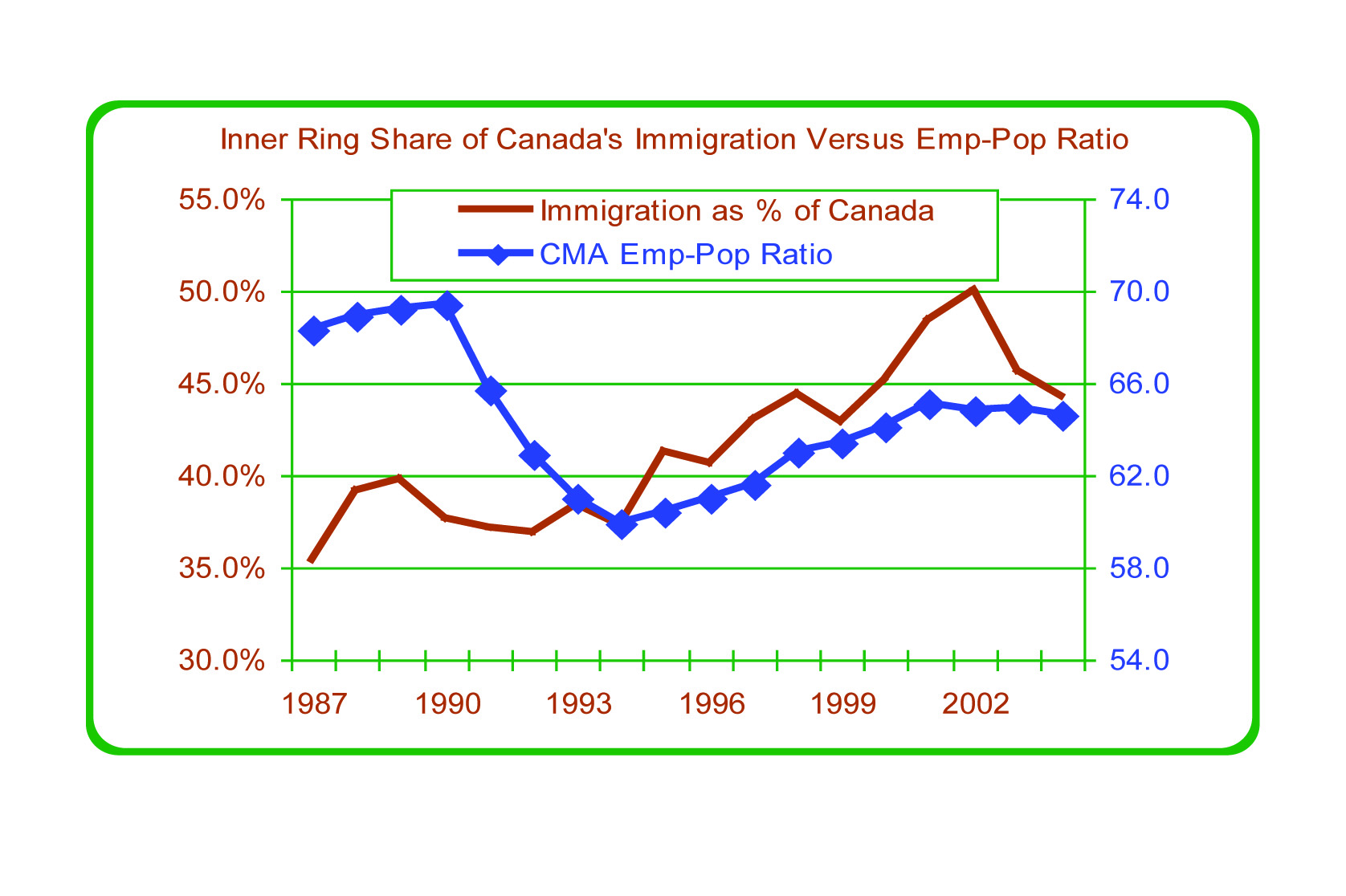
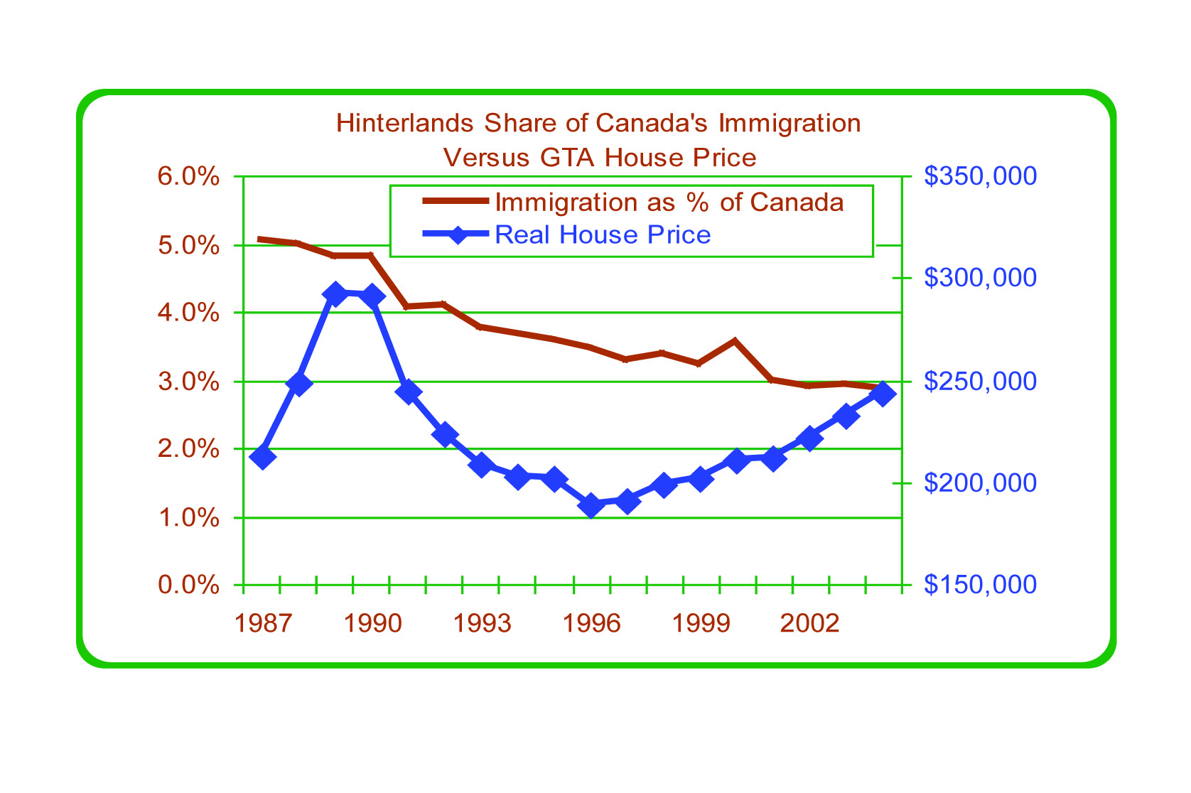
Figure 11 shows that in the early years of the period, the employment rate was very high, while the Inner Ring's share of immigration was low. Thus, other factors may influence the share. The average (inflation-adjusted) house price may help explain trends in immigration. Figure 12 compares the Inner Ring's share of Canada's immigration to the average house price in the GTA to determine whether rising house prices reduce the share.
Figure 12: Inner Ring's Share of Canada's Immigration vs. Average GTA House Prices, 1987 to 2004
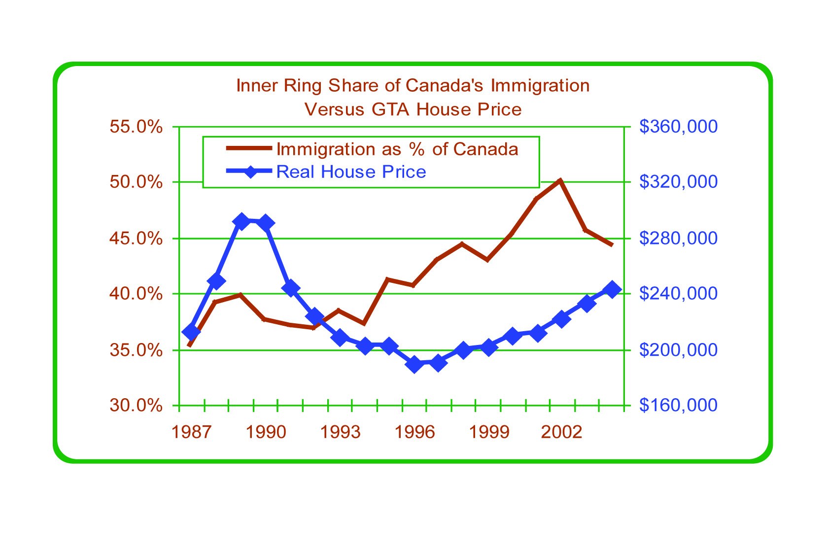
Although during the first part of the period, that seems to be the case, subsequently the share has risen when house prices are rising. As we will see later, the improving job market increased the Inner Ring's share of immigration to Canada, while rising house prices tended to reduce the Inner Ring's share.
Outer Ring
The Outer Ring tends to receive a small share of Canada's immigrants, and that share appears to be falling, as shown in Figure 13. There is no obvious relationship between the Toronto CMA employment ratio and the Outer Ring's share of immigration. Similarly, there is no clear relationship between house prices and the Outer Ring's share of immigration.
However, the 10 Census Divisions of the Outer Ring are far from homogeneous. Some may be more sensitive to economic conditions. Moreover, some may benefit when the GTA is strong economically and others may suffer. Therefore, each of the Census Divisions was analyzed individually. These analyses indicate that when GTA house prices rise, the Outer Ring may receive a very small increase in its share of immigration.
Figure 13: Outer Ring's Share of Canada's Immigration vs. GTA House Prices, 1987 to 2004
Greater Golden Horseshoe
There appears to be a positive relationship between the Toronto CMA employment ratio and the share of Canada's immigration received by the GGH as a whole, as shown in Figure 14. The share rose as the economy strengthened during the late 1990s, and fell as the employment ratio weakened between 2002 and 2004. Also, as the GTA average house price increased in real terms, the GGH's share of immigration tended to fall.
Figure 14: GGH Share of Canada's Immigration vs. Employment-to-Population Ratio, 1987 to 2004